CardCartão
One class, one surface.Uma classe, uma superfície.
CodeCódigo
<article class="vl-card"><span class="vl-kicker">Base</span><h3 class="vl-card__title">Card</h3><p class="vl-card__body">One class, one surface.</p></article>Ready-made parts with motion built in: cards, buttons, accordion, 3D objects, gallery, stats and a marquee. Each one is a class name on a plain element. They are optional, and Scenes work without them.Peças prontas com movimento embutido: cartões, botões, acordeão, objetos 3D, galeria, estatísticas e um marquee. Cada uma é um nome de classe em um elemento simples. São opcionais, e as Cenas funcionam sem elas.
Cards, buttons and small marks. Each one is a class name on a plain element, and the variants are modifiers on the same class.Cartões, botões e pequenas marcas. Cada um é um nome de classe em um elemento simples, e as variantes são modificadores da mesma classe.
9 components · open Code on any tile9 componentes · abra Code em qualquer bloco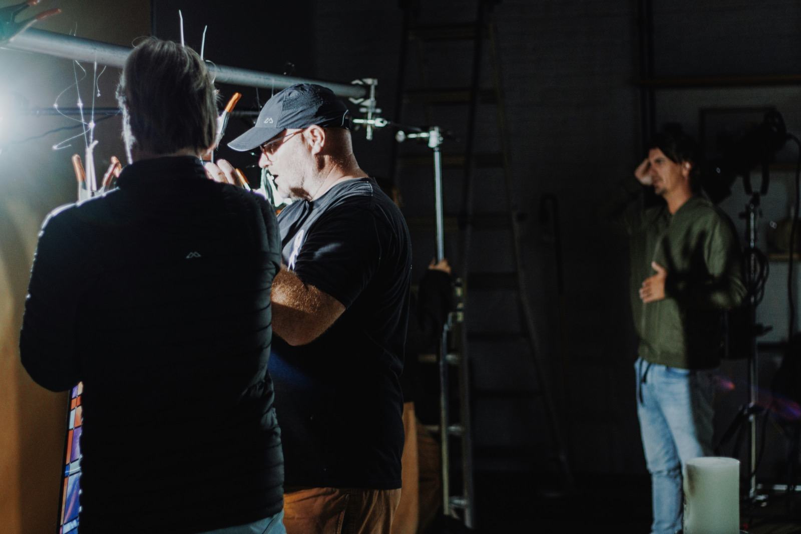
Surfaces take the light.As superfícies recebem a luz.
One class, one surface.Uma classe, uma superfície.
<article class="vl-card"><span class="vl-kicker">Base</span><h3 class="vl-card__title">Card</h3><p class="vl-card__body">One class, one surface.</p></article>Blur and a thin edge.Desfoque e uma borda fina.
<div style="padding:22px;background:radial-gradient(circle at 20% 30%,var(--accent) 0 28%,transparent 29%),radial-gradient(circle at 80% 70%,var(--fg) 0 22%,transparent 23%),repeating-linear-gradient(115deg,color-mix(in oklab,var(--accent) 45%,transparent) 0 6px,transparent 6px 18px)"><article class="vl-card vl-card--glass"><span class="vl-kicker">Variant</span><h3 class="vl-card__title">Glass</h3><p class="vl-card__body">Blur and a thin edge.</p></article></div>A slow light behind the text.Uma luz lenta atrás do texto.
<article class="vl-card vl-card--aurora"><span class="vl-kicker vl-kicker--pulse">Variant</span><h3 class="vl-card__title">Aurora</h3><p class="vl-card__body">A slow light behind the text.</p></article><a class="vl-cta" href="#surfaces">Primary</a>
<a class="vl-cta vl-cta--ghost" href="#surfaces">Ghost</a><div class="vl-stat"><span class="vl-stat__value">6</span><span class="vl-stat__label">motion channels</span></div><span class="vl-badge">Badge</span> <span class="vl-badge vl-badge--accent">Accent</span>Build with the browser, not against it.Velora principleConstrua com o navegador, não contra ele.Princípio do Velora
<blockquote class="vl-quote">Build with the browser, not against it.<cite>Velora principle</cite></blockquote>ShimmerShimmer
<p class="vl-gradient-text" style="font:800 2rem/1 var(--font-display)">Shimmer</p><div class="vl-counter vl-counter--scroll" role="img" aria-label="26" style="--vl-counter-to:26;--ct-range:entry 4% cover 24%;font:800 3rem/1 var(--font-display)"></div>Real 3D objects built from boxes and transforms. The container sets the perspective; the object turns. They stop under reduced motion.Objetos 3D reais feitos de caixas e transforms. O container define a perspectiva; o objeto gira. Param com movimento reduzido.
3 components · open Code on any tile3 componentes · abra Code em qualquer bloco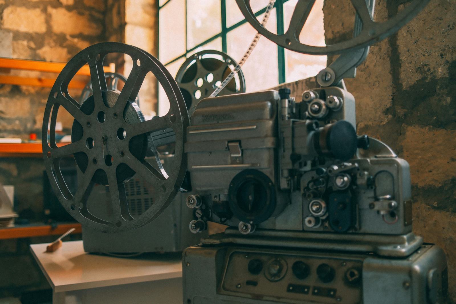
Depth with CSS 3D.Profundidade com CSS 3D.
<div class="vl-flip-card" tabindex="0" aria-label="Flip card. Hover or focus to see the back."><div class="vl-flip-card__inner"><div class="vl-flip-card__front"><b>Intent</b></div><div class="vl-flip-card__back"><b>Browser</b></div></div></div><div class="vl-3d-stage"><div class="vl-cube"><div class="vl-cube__face vl-cube__face--front">front</div><div class="vl-cube__face vl-cube__face--back">back</div><div class="vl-cube__face vl-cube__face--left">left</div><div class="vl-cube__face vl-cube__face--right">right</div><div class="vl-cube__face vl-cube__face--top">top</div><div class="vl-cube__face vl-cube__face--bottom">bottom</div></div></div><div class="vl-3d-stage"><div class="vl-orbit-system"><div class="vl-orbit-ring"><i class="vl-orbit-dot"></i></div><div class="vl-orbit-ring"><i class="vl-orbit-dot"></i></div><div class="vl-orbit-ring"><i class="vl-orbit-dot"></i></div></div></div>Galleries, captions, covers and loops. Layout comes from the class; the motion comes from the same channels you already know.Galerias, legendas, capas e loops. O layout vem da classe; o movimento vem dos mesmos canais que você já conhece.
6 components · open Code on any tile6 componentes · abra Code em qualquer blocoPictures that behave.Imagens que se comportam.
<div class="vl-gallery vl-gallery--mosaic">
<figure class="vl-gallery__item vl-gallery__item--wide"><img alt="Set Lights" src="img/set-lights.jpg"></figure>
<figure class="vl-gallery__item"><img alt="Projector" src="img/projector.jpg"></figure>
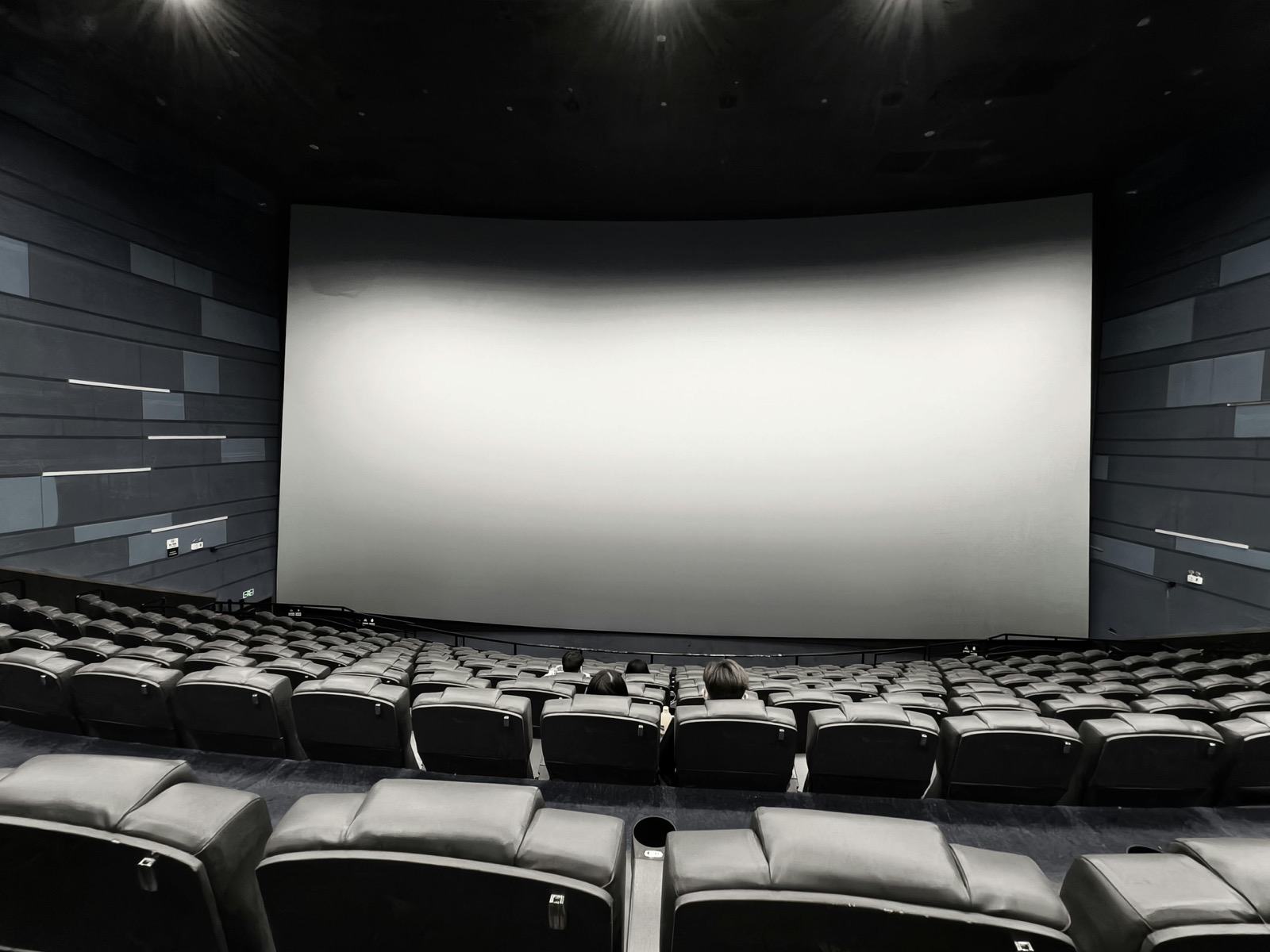
<figure class="vl-gallery__item"><img alt="Auditorium" src="img/auditorium.jpg"></figure>
<figure class="vl-gallery__item"><img alt="Set Lights" src="img/set-lights.jpg"></figure>
<figure class="vl-gallery__item vl-gallery__item--wide"><img alt="Projector" src="img/projector.jpg"></figure>
<figure class="vl-gallery__item"><img alt="Auditorium" src="img/auditorium.jpg"></figure>
<figure class="vl-gallery__item vl-gallery__item--wide"><img alt="Set Lights" src="img/set-lights.jpg"></figure>
<figure class="vl-gallery__item"><img alt="Projector" src="img/projector.jpg"></figure>
<figure class="vl-gallery__item"><img alt="Auditorium" src="img/auditorium.jpg"></figure>
</div><figure class="vl-media vl-media--16-9 vl-media--zoom"><img alt="Projector" src="img/projector.jpg"><figcaption class="vl-media__caption">Zoom on hover</figcaption></figure><div class="vl-marquee" aria-label="Velora vocabulary"><div class="vl-marquee__track"><span class="vl-marquee__item">Intent</span><span class="vl-marquee__item">Primitive</span><span class="vl-marquee__item">Channel</span><span class="vl-marquee__item">Scene</span><span class="vl-marquee__item" aria-hidden="true">Intent</span><span class="vl-marquee__item" aria-hidden="true">Primitive</span><span class="vl-marquee__item" aria-hidden="true">Channel</span><span class="vl-marquee__item" aria-hidden="true">Scene</span></div></div><section class="vl-banner vl-banner--ken"><div class="vl-banner__media"><img alt="" src="img/set-lights.jpg"></div><div class="vl-banner__scrim"></div><div class="vl-banner__content"><span class="vl-kicker">Reel A</span><h3 class="vl-banner__title">Light the scene.</h3><p class="vl-banner__lead">A cover with a slow push-in.</p></div></section><div class="vl-carousel vl-carousel--banner">
<input aria-label="Slide 1" checked class="vl-carousel__state" id="cf-c1" name="cf-c" type="radio">
<input aria-label="Slide 2" class="vl-carousel__state" id="cf-c2" name="cf-c" type="radio">
<input aria-label="Slide 3" class="vl-carousel__state" id="cf-c3" name="cf-c" type="radio">
<div class="vl-carousel__viewport"><div class="vl-carousel__strip">
<article class="vl-carousel__slide"><img alt="Film lights on a set" src="img/set-lights.jpg"><div class="vl-carousel__slide-overlay"><h3 class="vl-card__title">Light the scene.</h3></div></article>
<article class="vl-carousel__slide"><img alt="An empty cinema auditorium" src="img/auditorium.jpg"><div class="vl-carousel__slide-overlay"><h3 class="vl-card__title">Fill the room.</h3></div></article>
<article class="vl-carousel__slide"><img alt="A vintage film projector" src="img/projector.jpg"><div class="vl-carousel__slide-overlay"><h3 class="vl-card__title">Roll the film.</h3></div></article>
</div></div>
<div class="vl-carousel__arrows">
<label aria-label="Next slide" class="vl-carousel__arrow vl-carousel__arrow--next vl-carousel__when-slide-0" for="cf-c2">›</label>
<label aria-label="Previous slide" class="vl-carousel__arrow vl-carousel__arrow--prev vl-carousel__when-slide-1" for="cf-c1">‹</label>
<label aria-label="Next slide" class="vl-carousel__arrow vl-carousel__arrow--next vl-carousel__when-slide-1" for="cf-c3">›</label>
<label aria-label="Previous slide" class="vl-carousel__arrow vl-carousel__arrow--prev vl-carousel__when-slide-2" for="cf-c2">‹</label>
</div>
<div class="vl-slider-dots"><label aria-label="Go to slide 1" class="vl-slider-dots__dot" for="cf-c1"></label><label aria-label="Go to slide 2" class="vl-slider-dots__dot" for="cf-c2"></label><label aria-label="Go to slide 3" class="vl-slider-dots__dot" for="cf-c3"></label></div>
</div>The browser. Open and close are CSS.O navegador. Abrir e fechar são CSS.
It opens without the transition.Abre sem a transição.
<details class="vl-accordion" vl-state="expand" open><summary>What runs the animation?</summary><div class="vl-accordion__content"><p>The browser. Open and close are CSS.</p></div></details>
<details class="vl-accordion" vl-state="expand"><summary>What about reduced motion?</summary><div class="vl-accordion__content"><p>It opens without the transition.</p></div></details>Real inputs, selects and toggles. The class only styles them, so labels, validation and the keyboard stay native.Inputs, selects e toggles reais. A classe só os estiliza, então rótulos, validação e teclado continuam nativos.
9 components · open Code on any tile9 componentes · abra Code em qualquer blocoNative controls, dressed.Controles nativos, bem vestidos.
<div class="vl-field"><label class="vl-field__label" for="cf-name">Scene name</label><input class="vl-input" id="cf-name" placeholder="Opening shot"><span class="vl-field__hint">Shown in the call sheet.</span></div><select class="vl-select" aria-label="Skin"><option>Noir</option><option>Earth</option><option>Meridian</option></select><div><input class="vl-toggle" id="cf-tg" type="checkbox" checked><label for="cf-tg">Preview hover states</label></div><input class="vl-checkbox" id="cf-ck" type="checkbox" checked><label for="cf-ck">Shadows</label>
<input class="vl-radio" id="cf-r1" name="cf-r" type="radio" checked><label for="cf-r1">Hard cut</label>
<input class="vl-radio" id="cf-r2" name="cf-r" type="radio"><label for="cf-r2">Dissolve</label><div class="vl-field"><label class="vl-field__label" for="cf-ta">Note</label><textarea class="vl-textarea" id="cf-ta" rows="3" placeholder="What happens in this shot?"></textarea></div><div class="vl-input-group"><span class="vl-input-group__addon">veloracss.io/</span><input class="vl-input" aria-label="Page" placeholder="scenes"></div><div class="vl-range-wrap"><label class="vl-range-wrap__label" for="cf-rg">Intensity</label><input class="vl-range" id="cf-rg" type="range" min="0" max="100" value="60"></div><div class="vl-segmented" role="radiogroup" aria-label="Theme"><input type="radio" id="cf-s1" name="cf-seg" checked><label for="cf-s1">Auto</label><input type="radio" id="cf-s2" name="cf-seg"><label for="cf-s2">Light</label><input type="radio" id="cf-s3" name="cf-seg"><label for="cf-s3">Dark</label></div><div class="vl-choice" role="radiogroup" aria-label="Pick one"><div class="vl-choice__options"><label class="vl-choice__option"><input checked name="cf-ch" type="radio"><span>Intent</span></label><label class="vl-choice__option"><input name="cf-ch" type="radio"><span>Scene</span></label></div><div class="vl-choice__panels"><div class="vl-choice__panel" role="group" aria-label="Intent">Describe what you want.</div><div class="vl-choice__panel" role="group" aria-label="Scene">Put it on one clock.</div></div></div>Dialogs and popovers use the platform's top layer. Opening and closing are animated with @starting-style, and the buttons use commandfor and popovertarget.Diálogos e popovers usam o top layer da plataforma. Abrir e fechar são animados com @starting-style, e os botões usam commandfor e popovertarget.
5 components · open Code on any tile5 componentes · abra Code em qualquer blocoTop layer, no script.Top layer, sem script.
<button class="vl-cta" commandfor="cf-dialog" command="show-modal">Open dialog</button>
<dialog id="cf-dialog" class="vl-dialog" vl-state="top-layer"><div class="vl-dialog__header"><h3 class="vl-dialog__title">Scene ready</h3><button class="vl-dialog__close" commandfor="cf-dialog" command="close" aria-label="Close dialog">×</button></div><div class="vl-dialog__body"><p>Native dialog, animated by CSS.</p></div><div class="vl-dialog__footer"><button class="vl-cta" commandfor="cf-dialog" command="close">Approve</button></div></dialog>One independent contribution to a transform.Uma contribuição independente para um transform.
<button class="vl-cta vl-cta--ghost" popovertarget="cf-pop">What is a channel?</button>
<div id="cf-pop" class="vl-popover" popover vl-state="top-layer enter-exit"><strong>Channel</strong><p>One independent contribution to a transform.</p></div>Four Skins share one contract.Quatro Skins compartilham um contrato.
<button class="vl-cta vl-cta--ghost" popovertarget="cf-toast">Show toast</button>
<div id="cf-toast" class="vl-toast vl-toast--success" role="status" popover><span class="vl-toast__icon" aria-hidden="true">✓</span><div class="vl-toast__content"><strong>Scene tokens updated</strong><p>Four Skins share one contract.</p></div><button class="vl-toast__close" popovertarget="cf-toast" popovertargetaction="hide" aria-label="Close">×</button></div><span class="vl-tooltip-trigger" tabindex="0">Why channels?<span class="vl-tooltip">Each behaviour keeps its own transform.</span></span><div class="vl-command"><label class="vl-sr-only" for="cf-cmd">Find a recipe</label><input class="vl-command__input" id="cf-cmd" type="search" placeholder="Search enter, state or scene"><div class="vl-command__list"><button class="vl-command__item" type="button">Enter · clip-rise</button><button class="vl-command__item" type="button">State · top-layer</button><button class="vl-command__item" type="button">Scene · shared clock</button></div></div>The parts of a page around the content. This site's own header and footer are the .vl-header--cut and .vl-footer--cut variants.As partes de uma página ao redor do conteúdo. O cabeçalho e o rodapé deste site são as variantes .vl-header--cut e .vl-footer--cut.
6 components · open Code on any tile6 componentes · abra Code em qualquer blocoNavigation and page parts.Navegação e partes da página.
<nav class="vl-nav" aria-label="Sections"><a class="vl-nav__link vl-nav__link--active" href="#structure" aria-current="page">Learn</a><a class="vl-nav__link" href="#structure">Scenes</a><a class="vl-nav__link" href="#structure">Skins</a></nav>A title, a line, and a rule.Um título, uma linha e um filete.
<div class="vl-section-header"><h2 class="vl-section-header__title">Intent first</h2><p class="vl-section-header__desc">A title, a line, and a rule.</p></div>
<hr class="vl-section-rule"><nav aria-label="Breadcrumb"><ol class="vl-breadcrumb"><li class="vl-breadcrumb__item"><a href="#structure">Velora</a></li><li class="vl-breadcrumb__item"><a href="#structure">Components</a></li><li class="vl-breadcrumb__item" aria-current="page">Structure</li></ol></nav><hr class="vl-divider vl-divider--gradient"><hr class="vl-divider vl-divider--glow"><span class="vl-loading-spinner" aria-label="Loading"></span> <span class="vl-loading-dots" aria-label="Loading"></span>
<div class="vl-loading-skeleton vl-loading-skeleton--text" aria-hidden="true"></div><div class="vl-loading-skeleton vl-loading-skeleton--text" aria-hidden="true"></div><div class="vl-scroll-progress vl-scroll-progress--glow" role="presentation"></div>Finishing touches for surfaces. Each is one class; several are ambient loops, so they all stand still under reduced motion.Acabamentos para superfícies. Cada um é uma classe; vários são loops ambiente, então todos ficam parados com movimento reduzido.
12 components · open Code on any tile12 componentes · abra Code em qualquer blocoGlass, light and trace.Vidro, luz e traço.
<div style="padding:22px;background:radial-gradient(circle at 20% 30%,var(--accent) 0 28%,transparent 29%),radial-gradient(circle at 80% 70%,var(--fg) 0 22%,transparent 23%),repeating-linear-gradient(115deg,color-mix(in oklab,var(--accent) 45%,transparent) 0 6px,transparent 6px 18px)"><div class="vl-glass" style="padding:18px">Blur over what is behind.</div></div><div class="vl-glow" style="padding:18px 22px">A soft ring of the brand colour.</div><div class="vl-aurora" style="padding:28px 22px;color:var(--fg)">A slow gradient drift.</div><div class="vl-surface-premium" style="padding:22px">A lit surface with a soft shadow.</div><article class="vl-depth-card" tabindex="0" style="padding:20px"><b>Lifts on hover and focus</b></article><div class="vl-border-trace" style="padding:20px;border-radius:8px">A gradient hairline edge.</div><div class="vl-gradient-mesh vl-gradient-mesh--animate" style="min-height:130px;display:grid;place-items:center">Mesh</div><div class="vl-frame-cinematic"><img alt="" src="img/auditorium.jpg" style="display:block;width:100%;aspect-ratio:16/9;object-fit:cover"></div><button class="vl-cta vl-magnetic" type="button">Hover me</button><div style="position:relative;padding:28px 22px;border:1px solid var(--line);overflow:hidden"><div class="vl-ribbon"><span>New</span></div>Card content</div><div class="vl-marquee-v" style="height:110px;--vl-marquee-duration:9s"><div><span>Intent</span><span>Primitive</span><span>Channel</span><span>Scene</span><span>Intent</span><span>Primitive</span><span>Channel</span><span>Scene</span></div></div><h3 class="vl-text-mask vl-text-mask--gradient vl-text-mask--animate" style="font:800 2.4rem/1 var(--font-display)">Velora</h3>These parts need a whole page to show what they do, so they live where they belong: carousel, cover flow, stacking cards · horizontal section, scroll shadows · scene stage, call sheet, scroll markers · text effects · Skins · this site's header and footer are .vl-header--cut and .vl-footer--cut.Estas partes precisam de uma página inteira para mostrar o que fazem, então vivem onde pertencem: carrossel, cover flow, cartões empilhados · seção horizontal, sombras de rolagem · palco de cena, folha de chamada, scroll markers · efeitos de texto · Skins · o cabeçalho e o rodapé deste site são .vl-header--cut e .vl-footer--cut.